Thursday 15 December 2011

Director's Commentary research - past students' work

Past Student's video

This video goes straight into the answers, and does not show/read out the question. This is not bad in any way at all, but we feel that our answers would make a lot more sense with the questions included whether these are read out by someone or appear on-screen.
Using the green screen
This group also used the green screen so they could show their work in the background as they spoke, and this is really effective at amplifying their points, as we see the work as they speak about it.
They also all spoke about everything and had an equal share, which is what we would like to do as we all have our individual points and ideas to talk about.
However, this group did not include any of their music video which we feel would benefit our commentary to help get our points across, as the viewer can see exactly what we are talking about as it plays. They also did not keep their backgrounds on all the time, which was a bit distracting and inconsistent.
Overall, this group's work was really good and they all are clear and confident speakers using natural tones which is want we would want to use, and they all get their points across clearly. However we have decided to show a bit more of our work to get our points explained exactly.

Reflection on our story board

It was quite interesting to look back on our storyboard and see how much we stuck to it. The first few frames are the same as the storyboard - quite long shots of Alannah and Joe separately, establishing the scene. However, we added in the idea of using the mirror in the frame after we did our storyboard, after we watched Katy Perry's Thinking of You music video.
The majority of our past montage shots are also similar to our story board, except we added more of the handheld camera as once we started doing that, we really loved it so added much more than we originally planned we would.
We also added more shots such as Joe looking towards the door as he hears the knock, and the end shot which fades up into the sky, but overall we did stick to our storyboard quite well except for the addition of some new shots.

Editing our director's commentary

After researching into real and past students' director's commentary, we have decided to do ours quite simply with our questions appearing on the screens with our chosen song 'Letters' playing in the background. We will then include the shots of each member of our group talking, giving an even amount of time to everyone to make it fair. We will also incorporate examples of what we talk about from our music video, for example when we talk about the golden/pink hues from our video we will show part of that montage in those colours, to amplify our points.
Starting to edit our commentary
We put our clips (as you can see in the left of the image) in it's own bin, to keep separated from our original sequence. We wanted our commentary to be quite simple and natural so we could focus on the video, so we did not add many effects except for the fades of the questions.

Editing Diaries (uploaded later)

Our editing has gone really well and we are all contributing new ideas and effects to help improve it.

ROUGH CUT EDITING
Wednesday 19th October:
Today we imported the song we're using into Final Cut, and loaded our shots. We've started the basic placing of our shots ready for our rough cut deadline, and added the whole shot of Joe singing the entire song on the timeline, so we can pick and choose what parts we want to show of that.

Thursday 20th October:
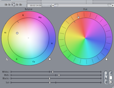
Using 'Color Corrector' to make a golden/pink hue
The outcome of our experimenting - the colouring we're using for our montages
Today we added more shots and started focusing on the colouring of our shots - we've started to experiment with the contrasts and brightness of the black and white shots. We also have decided on our golden/pink hue using colour corrector (shown above). We've also added most of our shots, except there is about a 15 second part where it is just Joe singing - we need to refine this.
We have received the feedback of our rough cut (blogged).

Wednesday 2nd November:
We blogged our rough cut, and organised our feedback which we also blogged.


FINAL CUT EDITING DIARY
Thursday 3rd November
After our feedback, we are experimenting with more effects and filters. We added in a cross dissolve to the start of the montages which creates a really nice effect as you see Joe singing on the left, as the couple bike into the shot from the right, creating a perfect framework.
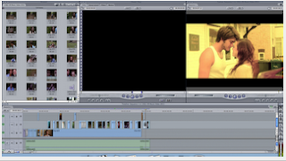
Editing our piece - as you can see, we have perfected our golden tones and have organised our shots

Monday 7th November & Wednesday 9th November
We added more cross dissolves in the part where Alannah thinks about the memories as she reads the letter for the second time. This just creates a nice smooth effect for the transition from present to past and back again. We also added the vignette filter to the montages for the past, to add to the handheld-camera effect and to distinguish more the difference in past and present. We have also refined our shots and changed the order slightly, to make our lyrics and visuals relationship stronger. We feel as if our video is complete and will blog it next week.

Monday 14th November
Blogged our final piece

Analysis of previous students digipack


Here we have taken a previous students group's digipack and looked at some of the connections they have made between their advert and dvd cover. On the dvd cover they have used a similar font to ours with that swirly effect and the colours are quite bold in some areas to attract the audience. The back of the dvd cover is effective as they have used a close up image of the male artist playing the guitar and we can clearly tell that this is a solo artist. On the magazine advert they have used an image from their music video which is a strong image, however the advert comes across as more of a single than an album. From the use of colour on both of the products we can instantly see that the genre is rock, alternative as they have used the logo 'NME' which is for this particular genre. Overall this digipack is really effective and has worked well together and by looking at this digipack it helped us in terms of displaying images and the layout. 

Examples of directors commentary


We researched into other directors commentary from some films and we chose to look at a commentary from the film 'The Notebook'. From looking at this video it has helped us produce our commentary, as we looked at the style they presented it in and how long it lasted.
This commentary shows examples directly from the film itself which is something we would like to do with our music video, as it demonstrates the point perfectly.
The directors also use a natural, conversational tone which makes the whole thing much easier to watch and listen to.
 
© 2009 13Q1-09 Music Video 2011. All Rights Reserved | Powered by Blogger
Design by psdvibe | Bloggerized By LawnyDesignz