Showing posts with label Alannah. Show all posts

Thursday, 15 December 2011

Director's Commentary research - past students' work

Past Student's video

This video goes straight into the answers, and does not show/read out the question. This is not bad in any way at all, but we feel that our answers would make a lot more sense with the questions included whether these are read out by someone or appear on-screen.
Using the green screen
This group also used the green screen so they could show their work in the background as they spoke, and this is really effective at amplifying their points, as we see the work as they speak about it.
They also all spoke about everything and had an equal share, which is what we would like to do as we all have our individual points and ideas to talk about.
However, this group did not include any of their music video which we feel would benefit our commentary to help get our points across, as the viewer can see exactly what we are talking about as it plays. They also did not keep their backgrounds on all the time, which was a bit distracting and inconsistent.
Overall, this group's work was really good and they all are clear and confident speakers using natural tones which is want we would want to use, and they all get their points across clearly. However we have decided to show a bit more of our work to get our points explained exactly.

Reflection on our story board

It was quite interesting to look back on our storyboard and see how much we stuck to it. The first few frames are the same as the storyboard - quite long shots of Alannah and Joe separately, establishing the scene. However, we added in the idea of using the mirror in the frame after we did our storyboard, after we watched Katy Perry's Thinking of You music video.
The majority of our past montage shots are also similar to our story board, except we added more of the handheld camera as once we started doing that, we really loved it so added much more than we originally planned we would.
We also added more shots such as Joe looking towards the door as he hears the knock, and the end shot which fades up into the sky, but overall we did stick to our storyboard quite well except for the addition of some new shots.

Editing our director's commentary

After researching into real and past students' director's commentary, we have decided to do ours quite simply with our questions appearing on the screens with our chosen song 'Letters' playing in the background. We will then include the shots of each member of our group talking, giving an even amount of time to everyone to make it fair. We will also incorporate examples of what we talk about from our music video, for example when we talk about the golden/pink hues from our video we will show part of that montage in those colours, to amplify our points.
Starting to edit our commentary
We put our clips (as you can see in the left of the image) in it's own bin, to keep separated from our original sequence. We wanted our commentary to be quite simple and natural so we could focus on the video, so we did not add many effects except for the fades of the questions.

Editing Diaries (uploaded later)

Our editing has gone really well and we are all contributing new ideas and effects to help improve it.

ROUGH CUT EDITING
Wednesday 19th October:
Today we imported the song we're using into Final Cut, and loaded our shots. We've started the basic placing of our shots ready for our rough cut deadline, and added the whole shot of Joe singing the entire song on the timeline, so we can pick and choose what parts we want to show of that.

Thursday 20th October:
Using 'Color Corrector' to make a golden/pink hue
The outcome of our experimenting - the colouring we're using for our montages
Today we added more shots and started focusing on the colouring of our shots - we've started to experiment with the contrasts and brightness of the black and white shots. We also have decided on our golden/pink hue using colour corrector (shown above). We've also added most of our shots, except there is about a 15 second part where it is just Joe singing - we need to refine this.
We have received the feedback of our rough cut (blogged).

Wednesday 2nd November:
We blogged our rough cut, and organised our feedback which we also blogged.


FINAL CUT EDITING DIARY
Thursday 3rd November
After our feedback, we are experimenting with more effects and filters. We added in a cross dissolve to the start of the montages which creates a really nice effect as you see Joe singing on the left, as the couple bike into the shot from the right, creating a perfect framework.
Editing our piece - as you can see, we have perfected our golden tones and have organised our shots

Monday 7th November & Wednesday 9th November
We added more cross dissolves in the part where Alannah thinks about the memories as she reads the letter for the second time. This just creates a nice smooth effect for the transition from present to past and back again. We also added the vignette filter to the montages for the past, to add to the handheld-camera effect and to distinguish more the difference in past and present. We have also refined our shots and changed the order slightly, to make our lyrics and visuals relationship stronger. We feel as if our video is complete and will blog it next week.

Monday 14th November
Blogged our final piece

Wednesday, 14 December 2011

Wednesday, 7 December 2011

Deadlines

Editing Commentary - Wed 14th December
Improving individual evaluations - Monday 12th December
Blog work - Thursday 15th December

To do:

  • More director's commentary research (past students' work)
  • Evaluation of one of last year's music video
  • Evaluation of our own commentary
  • Upload: editing of our rough cut diary and final cut diary, analysis into digipaks/mag adverts from past students and real ones, inspiration from Katy Perry's 'Thinking of You' (saved on Word)

Friday, 2 December 2011

Evaluation

1. In what ways does your media product use, develop or challenge forms and conventions of real media products?
The genre of our music video was pop/alternative, as the song was unique, romantic and acoustic. We incorporated the conventions of a romantic music video into our own, such as using a narrative - the story of a couple. We also showed the artist a lot playing his guitar and used him as the male lead in the story of the couple, similar to Enrique Inglesias' video for 'Hero', where he was the male lead in the narrative. We also looked at Adele's 'Someone Like You' video for inspiration and used the idea of black and white to portray a melancholic feeling. However, for the happy memory scenes we used a pink, golden hue, also inspired by Enrique's 'Hero' video. The locations we used were also typical of romantic music videos and films, such as the park and homes. We got the idea for using the bicycles and the park from the film The Notebook, and also from Katy Perry's 'Thinking of You' video. Both of these used the idea of cycling together and going to the park, typical romantic ideas. Our shots are also quite long and slow to match the pace of the song, rather than fast cuts as that would fit more with a dance/hip-hop video. Our magazine advert really sells the artist and also carries on our visual themes of love, black and white vs colour and love letters. We used an image of a rose and a letter in both our magazine ad and digipak - traditional images of romance. We were inspired by the digipak of 'Roxy music - An Evening With Roxy Music' with the use of a letter on the back page for our track list on our digipak as it fits in well with our theme of love letters.

2. How effective is the combination of your main product and ancillary texts?
Our main product and ancillary texts work well together as a promotional package as they all incorporate our visual themes of love, black and white vs colour and love letters. We were trying to highlight the main theme of love of the alum throughout all of our media products, using the colour red and the traditional romantic image of a rose in our ancillary products, and golden, pink hues in our video. They create a very sensitive, romantic image of the artist which would successfully attract a target audience of women of all ages, as he would be the image of a perfect lover.

3. What have you learnt from your audience feedback?
The feedback we have received has always been very helpful to us in creating the right kind of music video. The feedback of our initial ideas helped us be a bit more realistic, as we wanted to use a 1940s theme, linking us more directly to The Notebook, and we wanted to end the video in the rain. Our feedback supported our ideas for the love story, but said the 1940s theme and ending in the rain would be unrealistic and hard to do. We agreed with this so decided to not use those ideas as they would take up lots of time and money which we did not have. Again, the feedback for our rough cut was very positive and successful. The audience said that the narrative was easy to understand and the slow pace fitted in with the genre and the performance of the characters were convincing and "adorable". They did say that some lyrics could be highlighted more, so we changed and added some more shots to highlight certain lyrics, such as when the lyrics are "I'll always love you" it's a shot of the female lead. They also said we could use more effects, so we added more fades and a vignette filter around the home videos to highlight the home movies more. We also added more noise to highlight the home video, old effect. They also suggested an alternative ending of the female lead dying before seeing the male lead, yet we felt this was very overdramatic and could not be done because of time constraints.
The feedback of our final cut was very positive. They said there was a good use of dark and light colours and lighting to highlight the different emotions which is what we intended to do. They also said the handheld camera was very effective and natural and that the lyrics and visuals relationship was stronger, for example when he was singing about being alone and he is actually shown alone in his house. This shows that our reaction to the rough cut's feedback worked well, as we changed some shots to amplify the lyrics more. Overall our feedback has always been very positive.

4. How did you use new media technologies in the construction and research, planning and evaluation stages?
The software we used really helped to amplify the story of our music video. FInal Cut Express helped us make a productive, romantic music video as we used effects such as the vignette filter and fading to add a sensitive, soft atmosphere. Photoshop was also valuable in making our ancillary products. We used many layers in our magazine advert and digipak, of letters and roses to also create the feeling of love to highlight the theme of the entire album. Using Blogger was also really helpful in organising our ideas and research as well as our feedback. The HD cameras were also a great bonus to creating our music video as they made everything a lot sharper and realistic. All of these products helped enable us to be creative and to push our ideas even further.

Thursday, 1 December 2011

Music Video Director's Commentary Script

We want our commentary to look very natural and conversational, so we're going to focus on a few key points we want to make but not directly read from a script.

In what ways does your media product use, develop or challenge forms and conventions of real media products? 

  • love theme - through song and narrative, 
  • inspirations - Enrique - colours, included in story. Adele - black and white. Katy Perry (thinking of you) - in the mirror, sadness in black clothes, memories of bikes and picnics (locations)
  • technical elements: fades, vignette filter, handheld camera
  • alternative endings
  • mag advert: date, title, artist - rose
  • digipak - inspired by Roxy Music - letter on back page for track list, rose

How effective is the combination of your main product and ancillary texts?

  • all incorporate visual themes of love, love letters and the colours we used
  • sensitive, romantic image of artist to attract female target audience (image of perfect lover) 
  • rose  

What have you learnt from your audience feedback?

  • Our audience feedback was very valuable to us 
  • initial feedback: helped us be more realistic (1940s theme & rain) 
  • rough cut feedback: narrative easy to understand, convincing and adorable performance, needed better lip syncing, more effects, range of shots of Joe, visual+lyrics
  • alternative ending
  • positive final cut feedback: good use of colours/lighting to highlight emotions, good handheld camera, better visuals+lyrics

How did you use new media technologies in the construction and research, planning and evaluation stages?

  • Final Cut Express: helped create a productive, romantic music video (effects and filters)
  • Photoshop: 3 photographers in group, photoshop good  to use layers in mag advert/digipak, letters + roses, to highlight theme of album
  • blogger: helped to organise ideas and inspirations, and to recieve feedback
  • dafont.com for fonts
  • HD cameras: sharp, realistic footage

Monday, 28 November 2011

Homework - Director's commentary

Director's commentary can be presented as a video insert on a separate channel on the DVD. This commentary is a standard procedure when presenting additional media on a programmed DVD. In some cases you may see an interviewer and in other cases you will only see the director answering questions. Questions from interviewers could be, "What were your inspirations?" "Some critics say...what is your answer to these comments?" The directors usually give quite long, detailed answers.
The director usually talks about where the music video was shot and when, and why the director decided on these places and shots. The commentary also usually includes clips from the film/music video to demonstrate the director's points.

Monday, 21 November 2011

Magazine advert draft

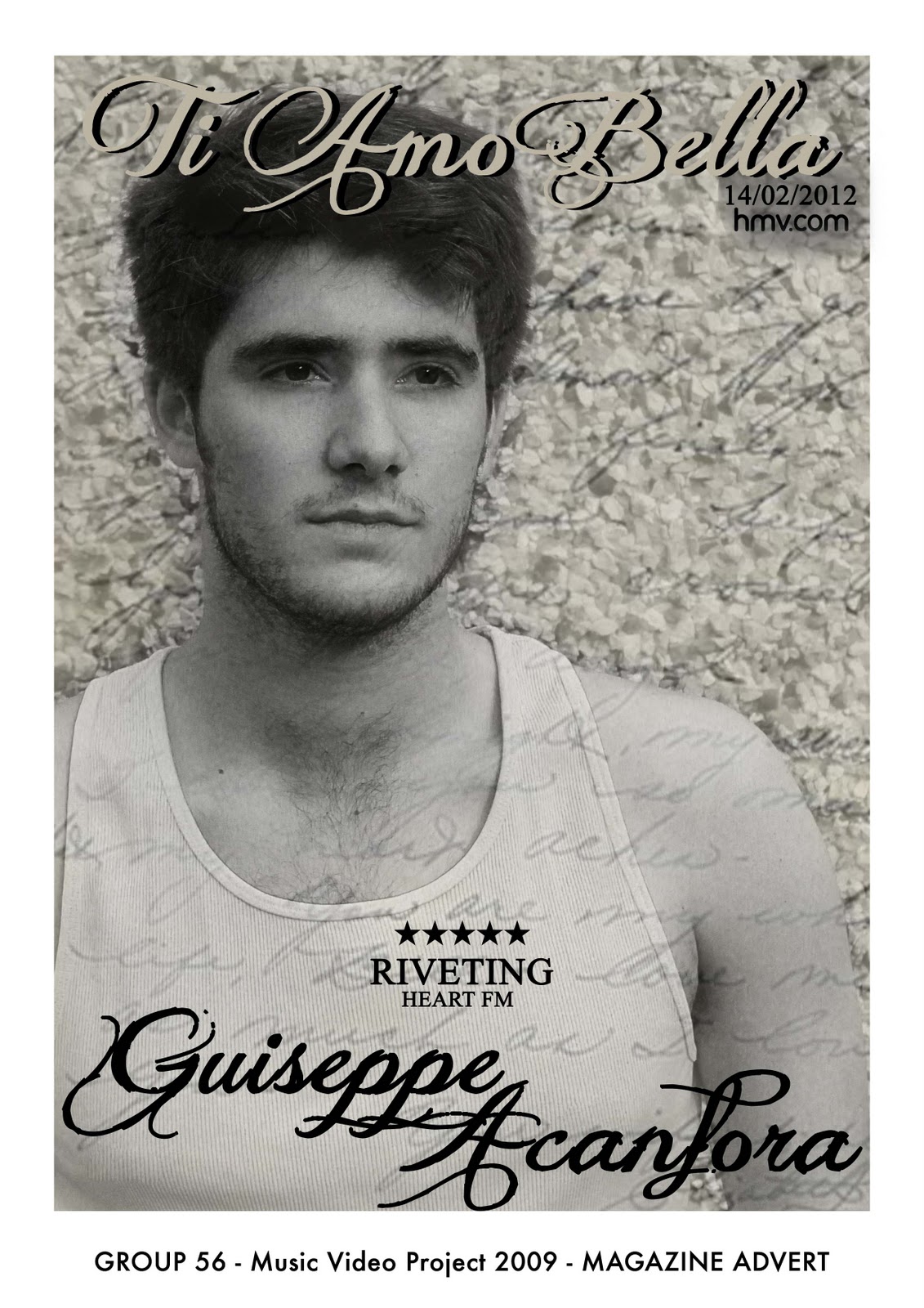
This is the draft for our magazine advert. We have layered an image of a 'love letter' behind and above an image of our artist. We did not want to use many effects and graphics as we feel our image is a very strong, emotional one which did not need much editing. By rubbing out the writing on our artist's face, we made his face stand out more, giving a 3D effect. We used  a slight sepia tone in the image to keep with our visual theme of sepia vs black and white, and we used the image of the love letter to also link with our other visual theme of letters/love.
We need to add a website and a kind of record label. We have also decided to change the layout slightly by moving the title as we feel it takes the eyes away from the artist too much. We also are going to change the date to 'out now' and remove the 'hmv.com' and the shadowing as it doesn't fit in with the image.

Wednesday, 16 November 2011

Visual Themes

The visual theme amongst our products (Music Video, Magazine Cover and Digipak) is the contrast of colours, interchanging between black and white, and the warm, golden, summers day effect.  Both effects resemble different emotions displayed by the characters with the black and white representing the sad times, and the warm colours taking the form of the characters happy times through montages.


For our digipak the front cover consist of an image revealing the artist. We intend on scheduling a photo-shoot so that we can use professional shots for our cover.

Another one of the main themes of our video is, obviously, 'love'. This is shown in our video through the narrative, and the whole idea of the album will be that it is a romantic, loving album. We want to tastefully convey the idea of love, and are thinking about using images such as love letters, roses and shots of our artist showing emotion to convey this theme. We also are going to use colours such as red/green and black to keep fitting in with this idea of love.

Font research for our magazine advert/digipak

We want to go for a soft, swirly font, like calligraphy. We looked at calligraphy on dafont.com and our favourites our these:

Analysis of magazine adverts

We have done some research on other student's and real examples of magazine adverts.

This is an example of a group of students' work from 2010.
We really like this image. The overlaying of images of swirls, music notes and the girl is extremely effective and creates a sensitive, romantic atmosphere. The colours, soft pinks and greys, also matches the romantic mood. The swirly, soft writing is effective, as well as the slight shadowing they used underneath it, reinforcing the band's name and song title.
As our video is a love song and is very romantic, we feel this kind of magazine advert would fit in well with our visual themes of colour/black and white, writing and love.
We have created a mood board with the kind of images we would like to use, and to test out our idea of overlaying images.

Monday, 14 November 2011

Our Final Music Video!


We feel our music video was a great success and turned out better than we had hoped it would. Our initial ideas did not happen the way we wanted due to timing issues and money, however we were able to successfully adapt our ideas to suit the deadlines and create a moving piece. One of our most successful ideas came by accident; Joe accidentally filmed Alannah in our test shots shakily and it was actually really effective, so we came up with the idea of using handheld cameras, like home videos, in our memory montage. We also thought of an alternative ending, which was that Alannah was running to Joe's house and was dramatically hit by a car, and the letter blew away, so Joe would never know she was going back to him. Unfortunately, we could not film this because of time constraints, and we also felt that this ending would over-dramatize the video and would be too obvious, as it would have included more running shots to build the tension.

Wednesday, 2 November 2011

Feedback for our rough cut

1. Goodwin: Good narrative and easy to understand; slow paced editing fits in with genre; lyrics+visuals - some lyrics could be highlighted more; good use of invisible camerawork
We are glad we have achieved the effect we wanted; for the video's narrative to be easy to understand and to fit in with the genre.
2. Editing: Pace fits music and editing is very natural; use of black and white works well; fade works well and could use more; doesn't need much more editing to keep natural style.
We're going to look into using effects such as fading and cross dissolves. We don't want to add too many effects as we would like to keep the video natural and not distracting.
3. Camerawork: shots steady with shaky hand held camera being a good contrast; could have a bigger variety of types but not a necessity; overall very good and clever shots.
We feel our shots have a good amount of variety, and any more would distract from the narrative. But we will look into our clips and see if we have any more different shots to use, to see how they'd fit in.
4. Mise en scene: Bikes were a good prop to match summer season and the happiness; costume was related and casual which matched feel of the song; location matched the music as well because the happy points were always outside
We are happy that the audience feel the location and props fit in well, as these were inspirations from the film The Notebook, one of the most romantic films of all time, and we are happy they worked well.
5. Creativity and Performance: very well lip synced, roles very convincing and adorable; story line suited the song and was very clear.
We wanted to convey a deep, meaningful emotion and glad this came across tastefully.

Overall, our feedback was really successful. We have a few more shots to add in and will use the feedback's ideas of using more effects such as fading/dissolving. We will also think about different styles of shots to use for which we'll need the emergency filming day.

Rough Cut

 
© 2009 13Q1-09 Music Video 2011. All Rights Reserved | Powered by Blogger
Design by psdvibe | Bloggerized By LawnyDesignz