1.) In what ways does your media product use, develop or challenge forms and conventions of real media products?
Our finalised music video successfully fits the conventions of a typical love song for many reasons. The narrative takes the form of a love sequence and makes references to well known love films e.g 'The Notebook', bike riding scene. We did, however make it evident that it was a music video by establishing the artist and distinguishing the difference between him and his lady. One factor we were happy with was how we managed to link the lyrics with the visuals and music, making it more meaningful and believable through characters, concluding in a very sensitive love piece to attract our intended target audience. Our direct notion has been achieved through our camerawork, as we used POV shots to represent happy montages between the couple. As they are looking directly into the camera it gets the audience comfortably involved in the full extent of the relationship, not as if they are intruding. Again, the editing conforms to the conventions of the theme of love, mainly through our colour scheme. We converted the the lonely, sad times into black and white, whereas the happy montages where we used a warm summers day end colour. It allows the audience to adopt the characters emotions and understand their thoughts and feelings throughout. The only way in which we could have challenged our product would be by subverting from the typical 'happy ending' and followed an alternative ending. An example of this would be killing off the female character at the point of climax where the audience are led to believe she will return to the male character. We considered this as a potential ending, however due to lack of time and props we decided against the idea.
2.) How effective is the combination of your main product and ancillary texts?
The combination of our main product and our ancillary texts are very effective in establishing the artist to suit our intended female audience through the romance displayed. All three products follow a similar colour scheme, contrasting between light and dark colours, allowing them to appear iconic to the artist, as opposed to just one of his songs. It is representative of an album makes the artist more recognizable to an audience. We also include an iconic symbol of a rose in both the magazine advertisement and our digipak. Through the close up effect of portraying the artist it successfully attracts our intended target audience as it shows the artist in positive light, therefore presenting as a person that the audience can relate to, as well as his music.
3.) What have you learnt from your audience feedback?
We learnt a lot of the audience feedback process. Initially the pitch we performed was a success capturing people's attention and generally being thought of as a good idea for a love song. Our only real criticism was the curiosity and concern that it may portrayed more as a film scene than a music video and that we may be pushing boundaries. We bared this in mind and successfully avoided that hurdle as we distinguished the artist very clearly through many different elements, particularly camerawork and editing. After completing the rough cut it was given very positive feedback. The chosen colour scheme and emotive skills by Alannah and myself were regularly commented on. Our only negative feedback was given towards our editing process. We were told to shorten certain shots as they were too uncomfortably for the audience to watch and didn't fit the tempo of the music. We were also told to neaten up the montages with an effect to make it feel more like a home movie. We took this advice into consideration and fixed the changes. The longer shots were cut down, which proved to fit much nicer with the music allowing the video to flow more. We also decided to add a vignette effect to the montage clips which visually made it appear more from the perspective of the character through a video camera and worked beautifully. Overall the feedback we were given through the process was great, allowing us to develop and create a fantastic music video.
4.) How did you use new media technologies in the construction and research, planning and evaluation stages?
There were a range of media technologies we had to use in order to develop our final product. To construct our video we had to use Final Cut, which was good as every member of our group was familiar with the programme from the previous year, therefore allowing us to work faster and more efficiently. To develop our magazine advertisement and digipak we had to use Photoshop. This was another programme we were happy to use as three members of our group were used to using it from their photography work. Again this allowed to us to work faster and develop a better product. the advanced level of the programme's we were using allowed us to be extremely creative with our work, particularly the editing processes. This is because we were able to add effects to our products to make them look more professional than we expected, and only on rare occasion would it slow us down.
Wednesday, 30 November 2011

Monday, 28 November 2011
Homework - Director's commentary
Director's commentary can be presented as a video insert on a separate channel on the DVD. This commentary is a standard procedure when presenting additional media on a programmed DVD. In some cases you may see an interviewer and in other cases you will only see the director answering questions. Questions from interviewers could be, "What were your inspirations?" "Some critics say...what is your answer to these comments?" The directors usually give quite long, detailed answers.
The director usually talks about where the music video was shot and when, and why the director decided on these places and shots. The commentary also usually includes clips from the film/music video to demonstrate the director's points. Thursday, 24 November 2011


Monday, 21 November 2011
Magazine advert draft
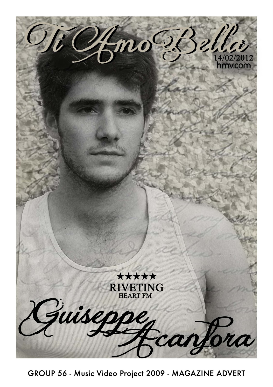 This is the draft for our magazine advert. We have layered an image of a 'love letter' behind and above an image of our artist. We did not want to use many effects and graphics as we feel our image is a very strong, emotional one which did not need much editing. By rubbing out the writing on our artist's face, we made his face stand out more, giving a 3D effect. We used a slight sepia tone in the image to keep with our visual theme of sepia vs black and white, and we used the image of the love letter to also link with our other visual theme of letters/love.
We need to add a website and a kind of record label. We have also decided to change the layout slightly by moving the title as we feel it takes the eyes away from the artist too much. We also are going to change the date to 'out now' and remove the 'hmv.com' and the shadowing as it doesn't fit in with the image.
Wednesday, 16 November 2011
Visual Themes
The visual theme amongst our products (Music Video, Magazine Cover and Digipak) is the contrast of colours, interchanging between black and white, and the warm, golden, summers day effect. Both effects resemble different emotions displayed by the characters with the black and white representing the sad times, and the warm colours taking the form of the characters happy times through montages.


For our digipak the front cover consist of an image revealing the artist. We intend on scheduling a photo-shoot so that we can use professional shots for our cover.
Another one of the main themes of our video is, obviously, 'love'. This is shown in our video through the narrative, and the whole idea of the album will be that it is a romantic, loving album. We want to tastefully convey the idea of love, and are thinking about using images such as love letters, roses and shots of our artist showing emotion to convey this theme. We also are going to use colours such as red/green and black to keep fitting in with this idea of love.
Another one of the main themes of our video is, obviously, 'love'. This is shown in our video through the narrative, and the whole idea of the album will be that it is a romantic, loving album. We want to tastefully convey the idea of love, and are thinking about using images such as love letters, roses and shots of our artist showing emotion to convey this theme. We also are going to use colours such as red/green and black to keep fitting in with this idea of love.
Font research for our magazine advert/digipak
We want to go for a soft, swirly font, like calligraphy. We looked at calligraphy on dafont.com and our favourites our these:


Subscribe to:
Posts (Atom)